Blog—DEC 11, 2025
Creating the visual identity of Love Supreme: a conversation with Pentagram's Marina Willer
Inside Marina Willer’s creative process at Pentagram, revealing how experimentation brought Love Supreme’s visual identity to life.
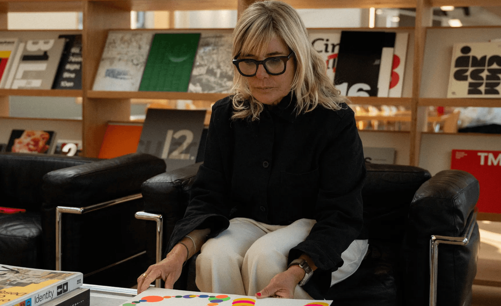
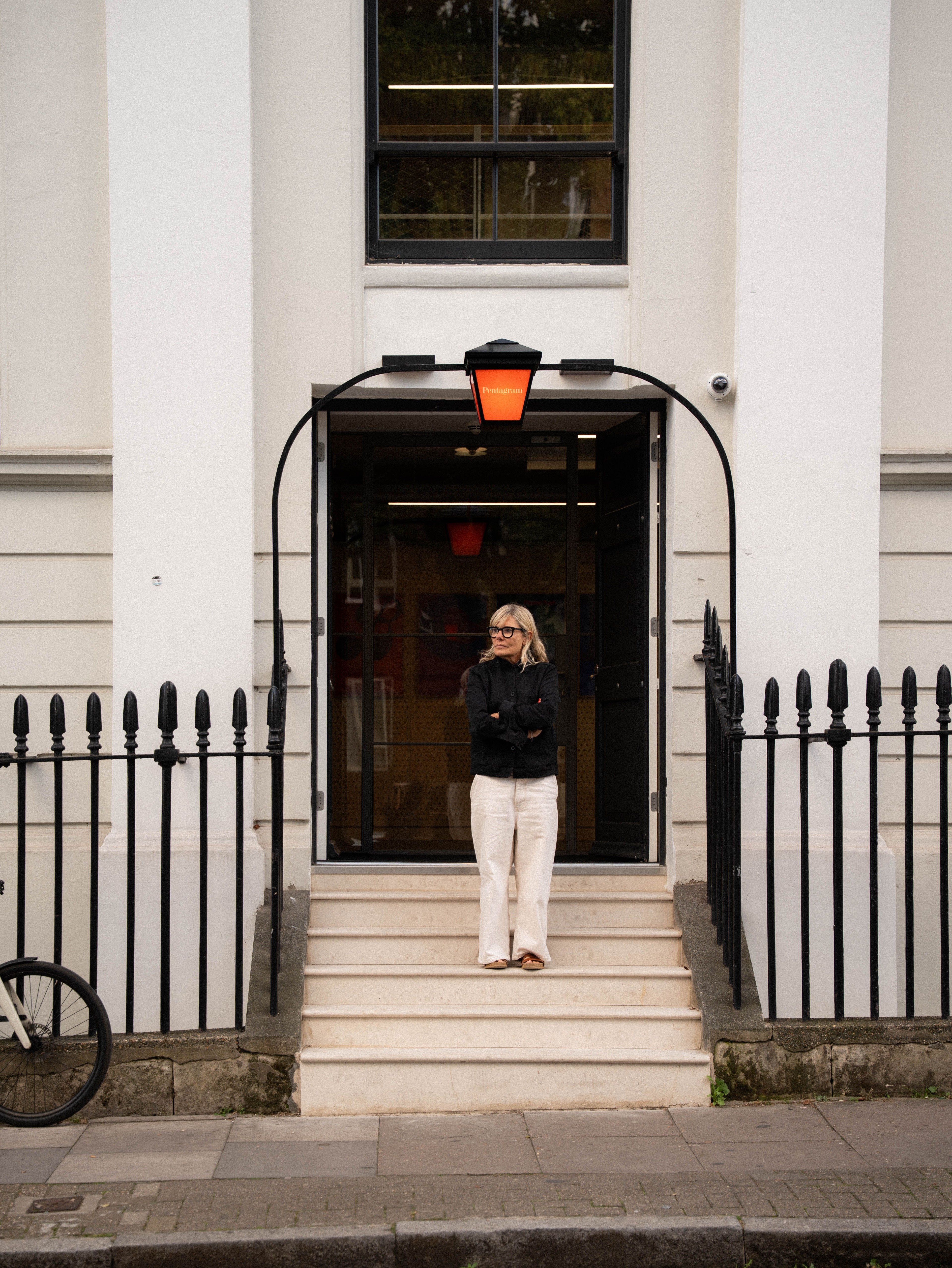
Marina Willer is a Partner and Creative Director at Pentagram London, where she leads a team of designers working across branding, strategy, and graphic design.
She joined us for an inspiring conversation about her experimental approach to design: what sparks it, how it unfolds, and why pushing boundaries is so essential to her creative process.
We connected with Marina while creating merch for Love Supreme Projects, a London-based yoga studio rooted in mindfulness and design. She walked us through how their visual identity came to life: a process she approached through hands-on work and continuous experimentation.
In our conversation, Marina shares the influences that shaped her creative vision, how Pentagram’s unique structure encourages freedom and experimentation, and why creativity sits at the center of every project she takes on, including Love Supreme.
Can you introduce yourself and tell us what you do?
Marina explained that she is a Partner and Creative Director at Pentagram, where she runs a team of creatives. Each partner leads their own team, working very independently, almost like running a small practice, while still being part of a larger collective.
“My work is mostly around branding,” she said, “but branding in a very broad sense.” For her, that includes concepts, identity systems, graphic design, and a lot of experimentation, essentially whatever a project needs. She also makes films, which remain a significant part of her creative life, and continues her personal practice as a graphic artist.
Branding, she noted, can take many different forms, which keeps her role deeply creative and very hands-on across a wide range of projects.
What inspired you to work in design?
“I grew up in a very creative environment. My dad was an architect, my mom is a potter. So design and making things were always present in our home.
As a kid, I was always painting, drawing, inventing things, building odd constructions with whatever I could get my hands on. I think creativity came before design. It came from this passion for making things. Design just became the natural direction.”
How would you describe your creative approach, and Pentagram’s?
“Pentagram has a lot of freedom in its model and structure. Each partner runs their team almost like their own start-up, which allows us to work in very creative, engaged, hands-on ways.
My creative process relies on less conventional methods, more experimental approaches that truly respond to the outcome and the needs of a particular project. Every project asks for something different. I always try to make each result unique.”
Love Supreme is a great example of that experimental approach. How did the identity begin?
Marina describes Love Supreme as “a very magical client” with a beautiful and intuitive way of doing things. While many branding projects demand heavy strategy, this one asked for something different: exploring and expressing the client’s understanding of spirituality and intuition, elements she felt were deeply unique to them.
She explained that their approach to yoga is rooted in the idea of looking inwards to find one’s inner energy and then projecting it outward. For Love Supreme, that inner strength becomes abundance and energy: a way of seeing yoga not as something quiet or decorative, but as a practice of self-awakening.
Breaking stereotypes was essential. “The idea of yoga being pastel, calm, beige, lilac, very quiet… this was the opposite,” she said.
The identity needed to feel like awakening, like discovering the inner self, and the team wanted to express that depth in a way that felt contemporary, poetic, and beautiful.
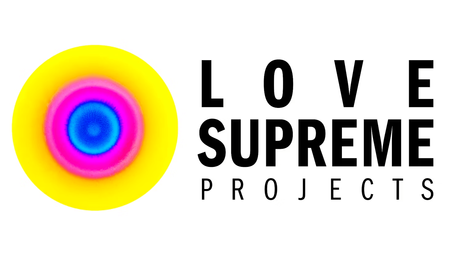
So where did the idea for the ink explosions come from?
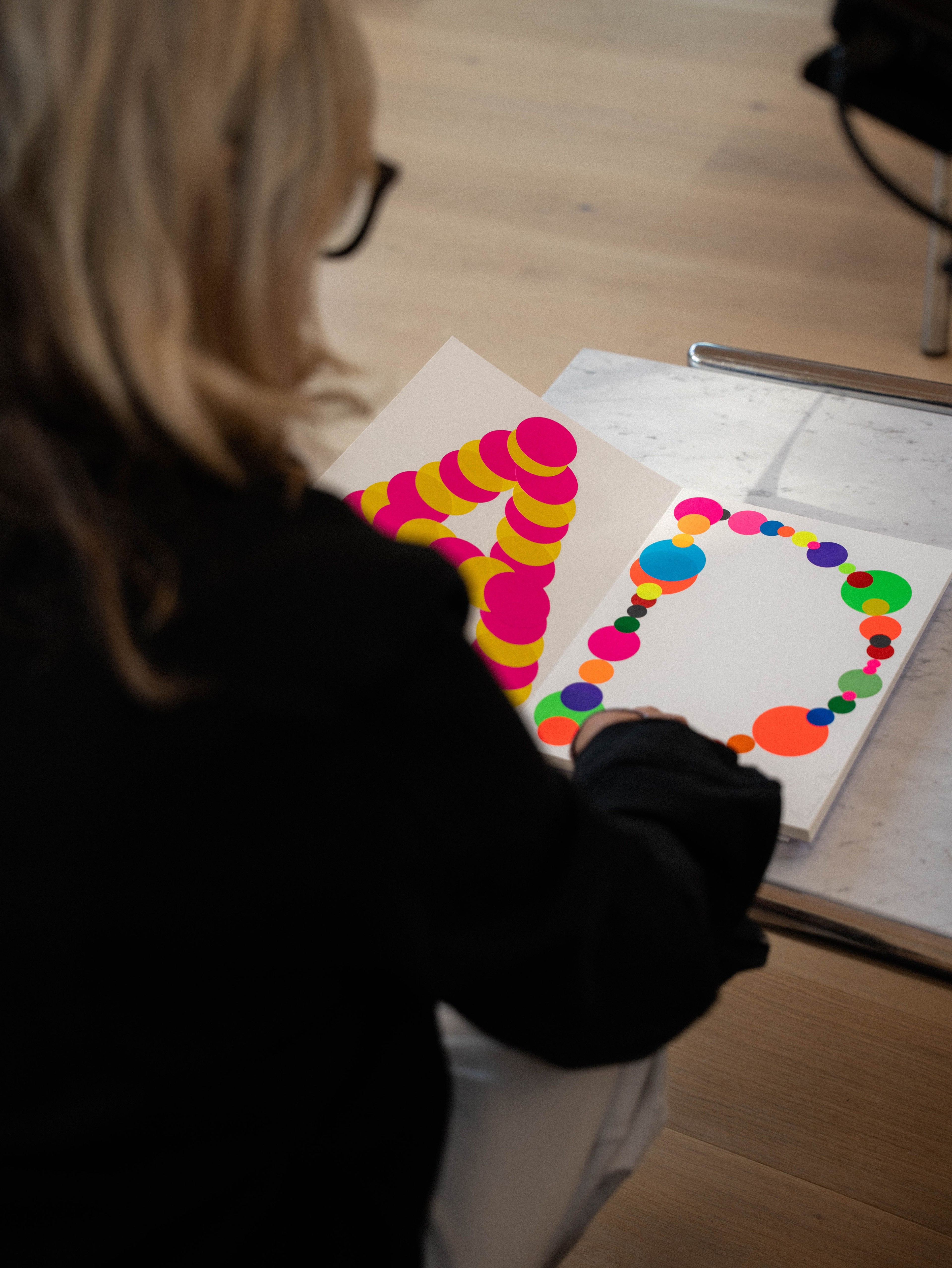
Marina explained that the word yoga comes from yoke, meaning “to unite,” and this sense of union and centering became an early visual reference.
The team set out to create what she described as “an explosion of color and energy,” something that reflected the feeling of being centered and present, and how that presence can release a contagious force.
“The brief to my team and to myself was: how can we use ink to create a sense of color exploding from a center point?” she said.
They worked physically with ink and liquids to create the right reactions, developing a collectively chosen color palette. Marina said the result felt like an immediate expression of Love Supreme’s essence, not something strategised, but something translated directly from who they are.
Movement mattered, too. The team animated the explosions through photography and film, creating a dialogue between stillness and motion.
Even the typography carried intention, subtly referencing jazz and John Coltrane’s album covers — fitting, since Love Supreme plays a lot of jazz during their sessions.
How did you ensure the system worked consistently across posters, digital, motion, merch… everything?
“When we create a brand, we think about every application from the beginning. We know it needs to work in motion. We also film and print at a very large scale, almost like producing something for cinema, which requires extremely high resolution.
You don’t need to add effects. It’s just one idea expressed consistently, carrying the same vibrancy across everything we designed for them.
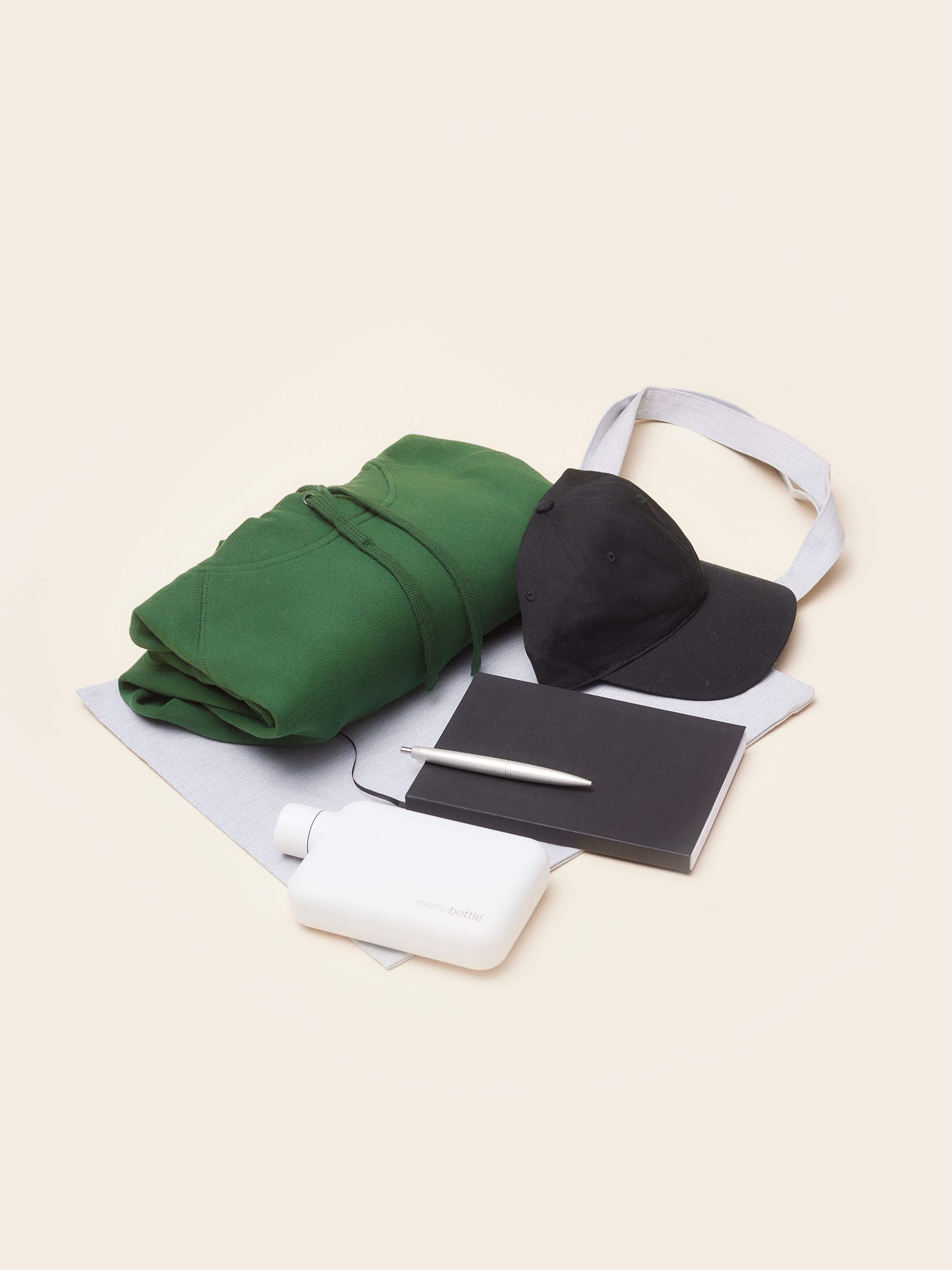
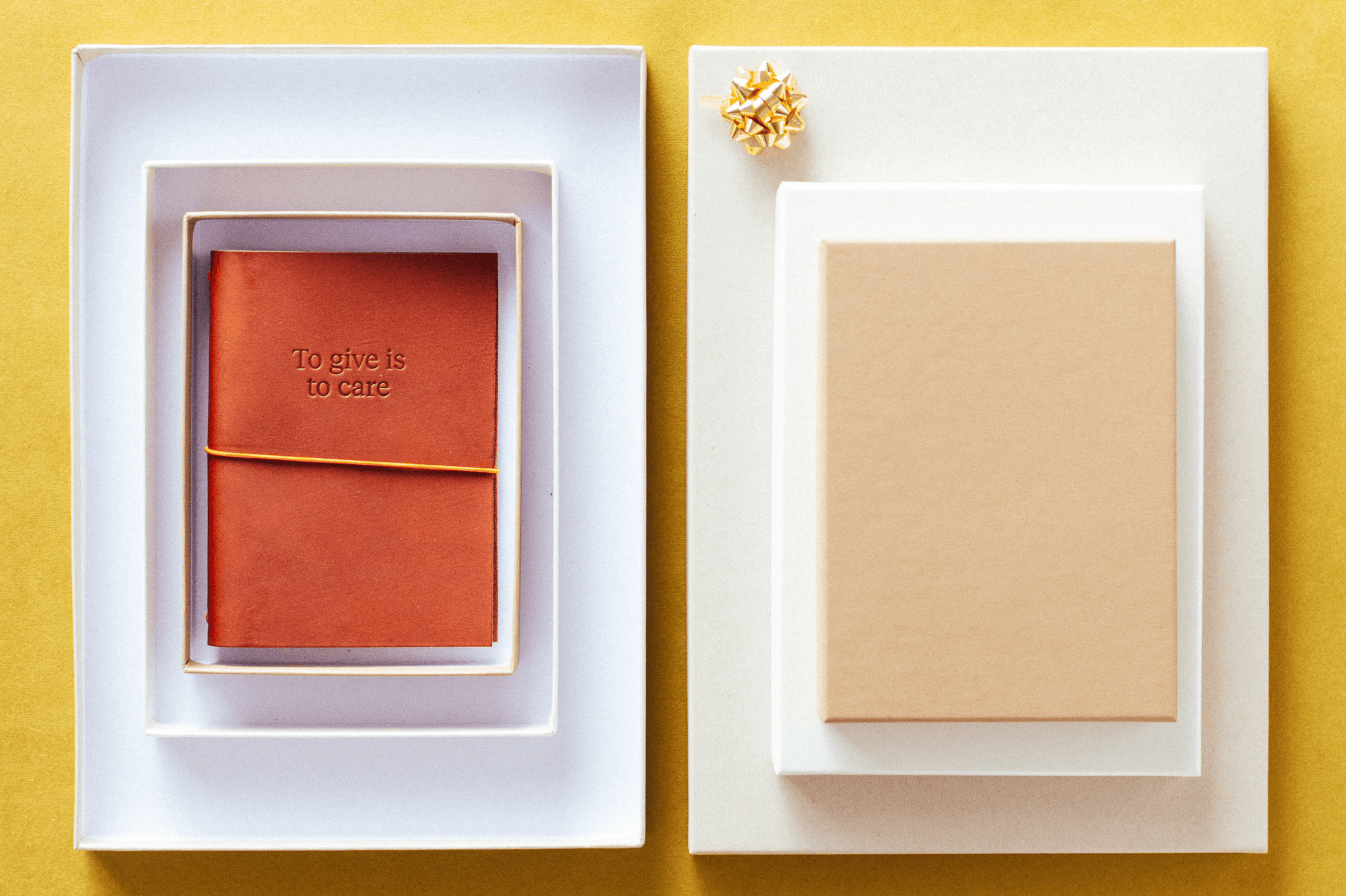
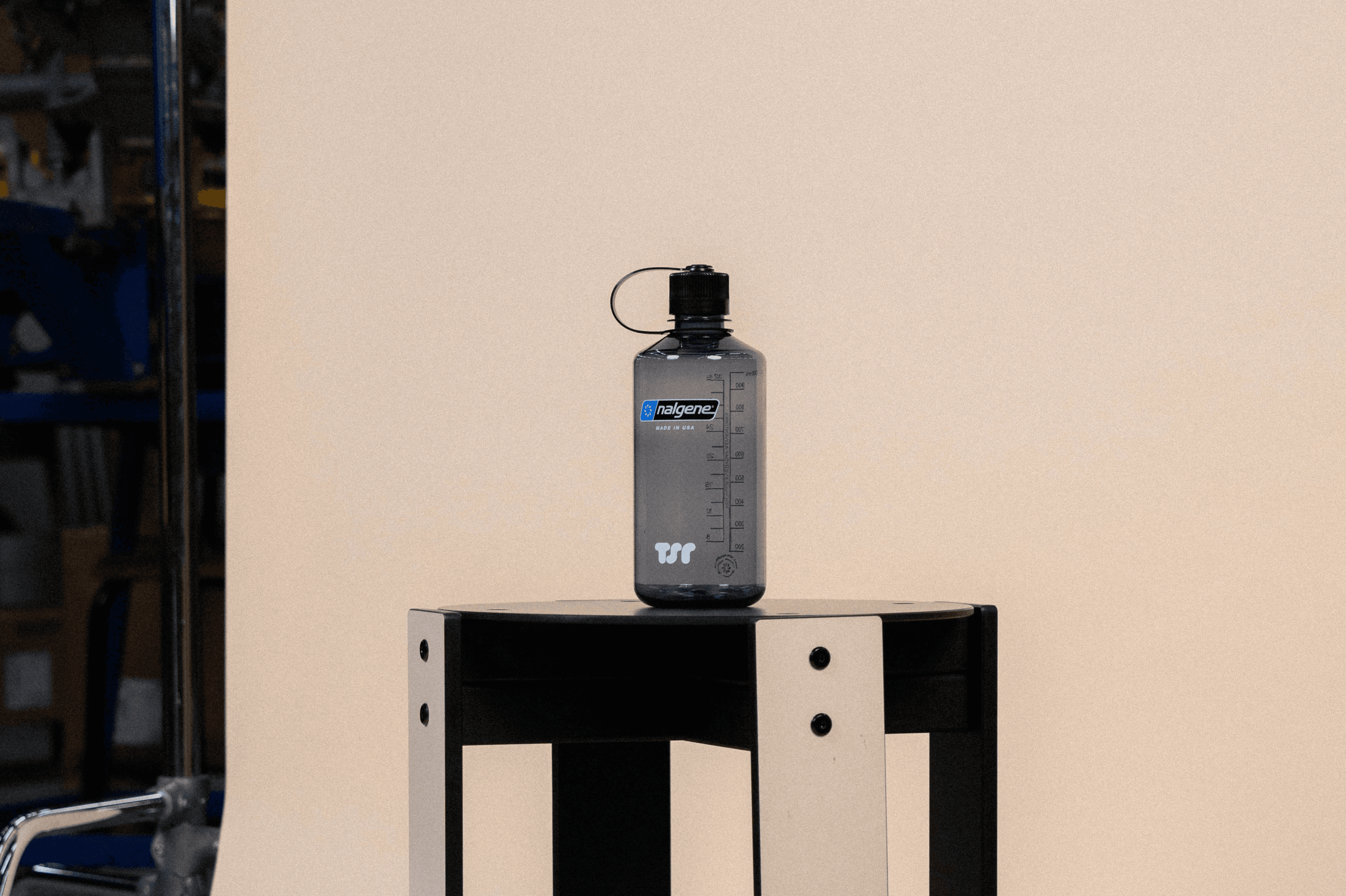
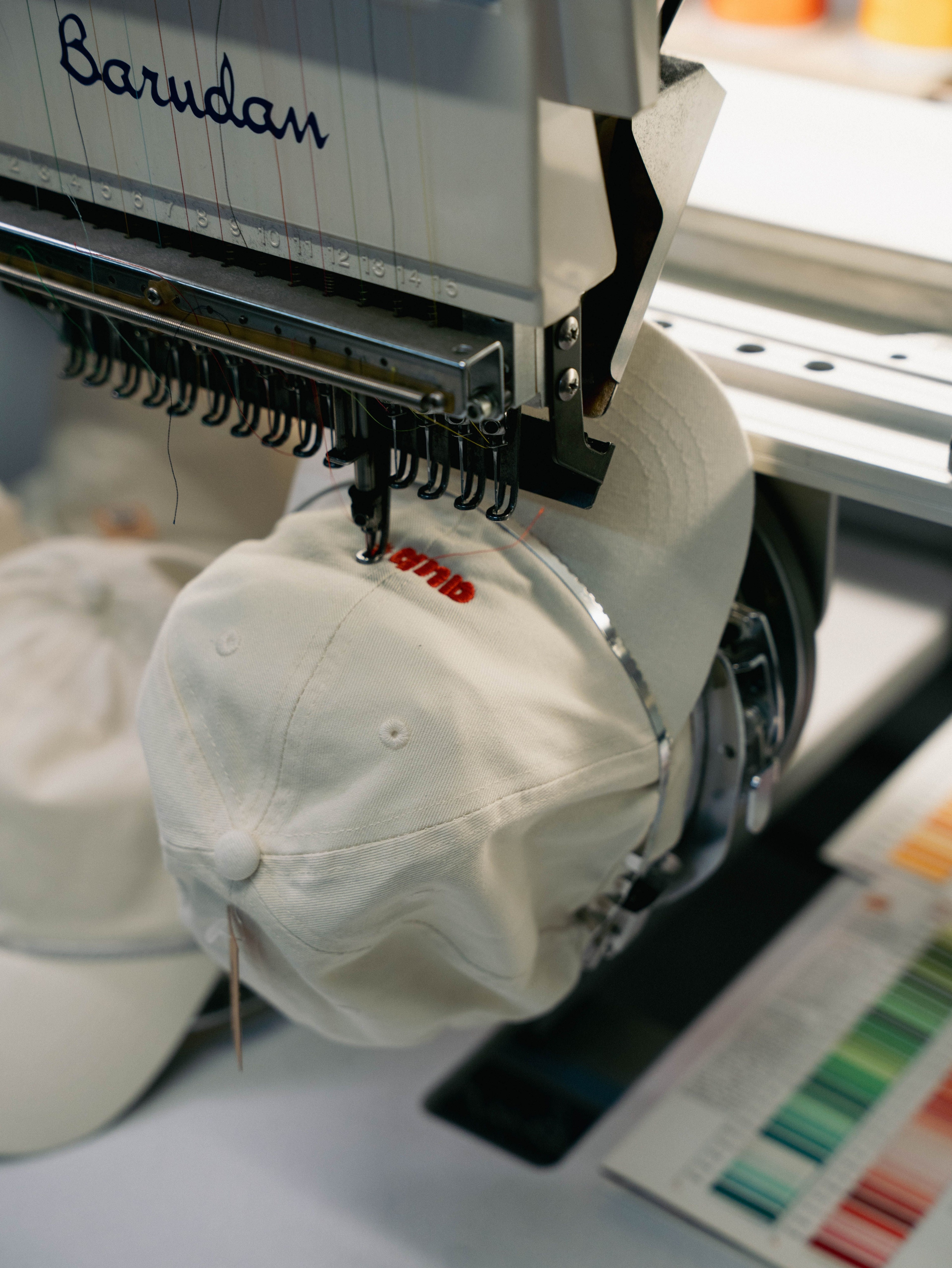
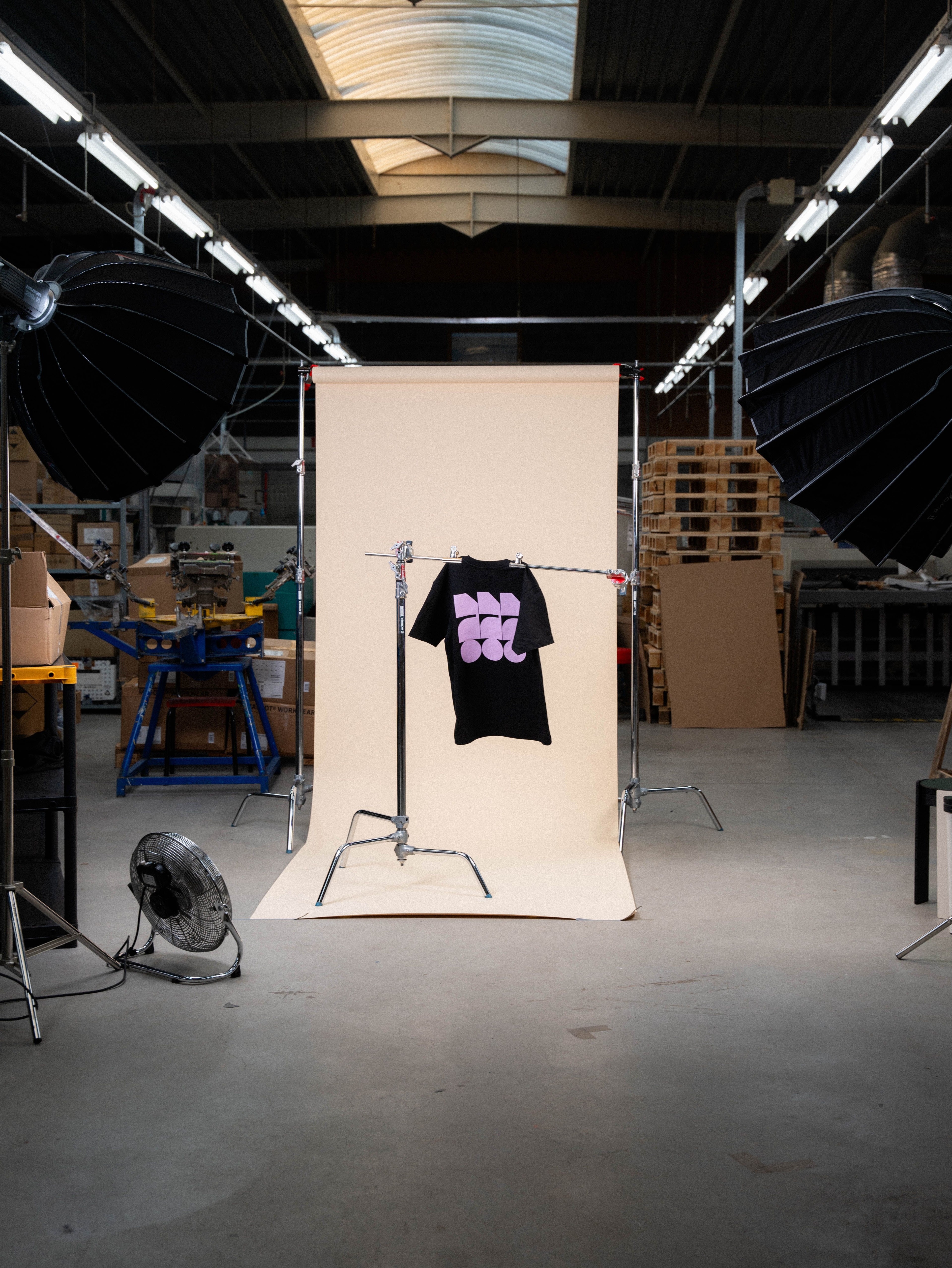
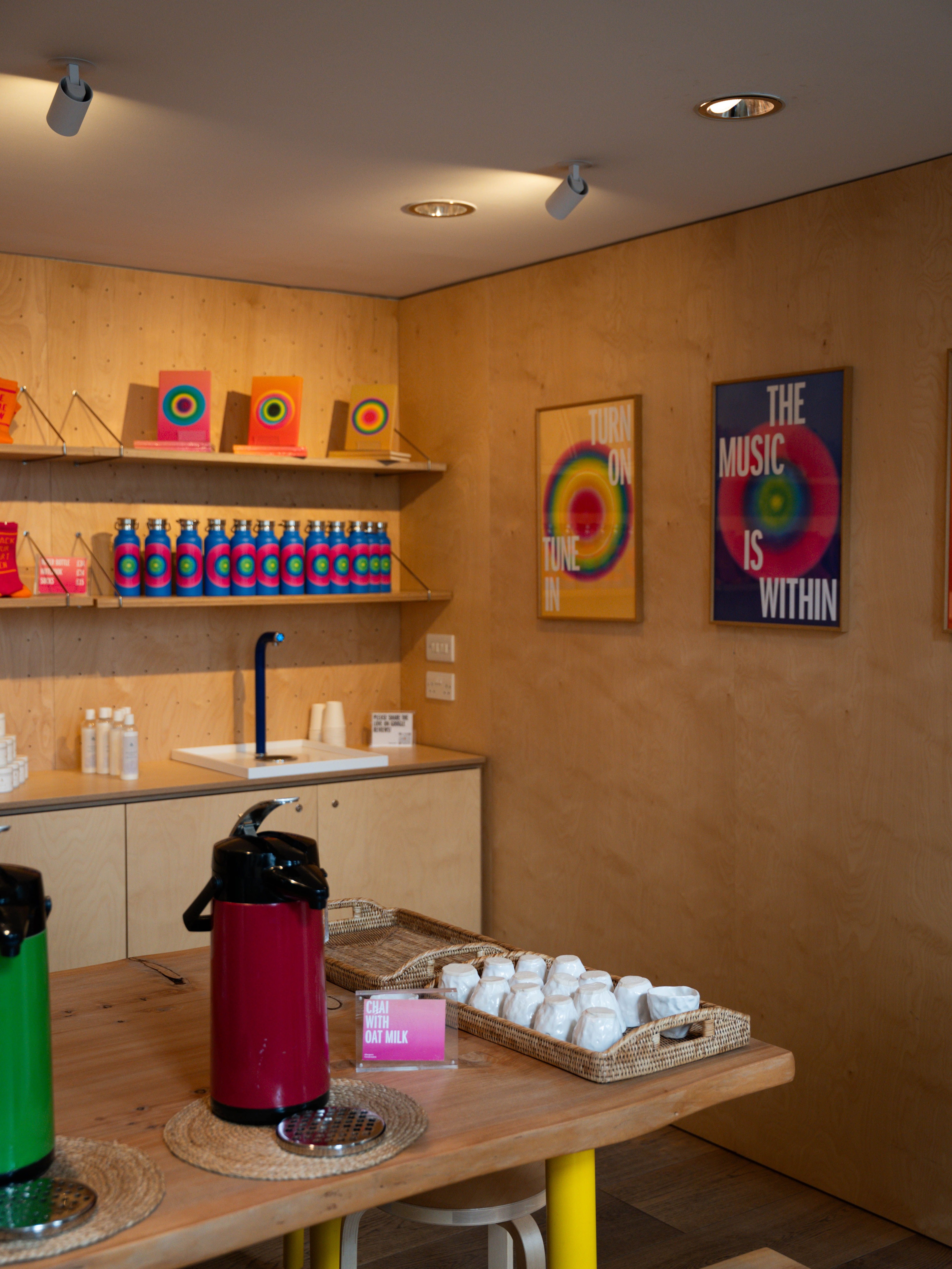
And what about the merch?
Marina explained that the brand needed to feel visually iconic, not only because it expresses a powerful process of yoga and awakening, but because Love Supreme is an exceptional client.
“They’re so tasteful, inspiring, elegant,” she said, and the design had to reflect that level of sophistication.
To translate that into merchandise, the team created objects that felt beautifully crafted and made with intention. “The notebooks, the bottles, the postcards… everything had to feel amazing,” she said. These weren’t meant to be casual items, but pieces people would keep and cherish.
She believes the brand helped Love Supreme become more visible without ever feeling commercial. “It feels unique,” she said, and that uniqueness helped protect the project’s exclusivity.
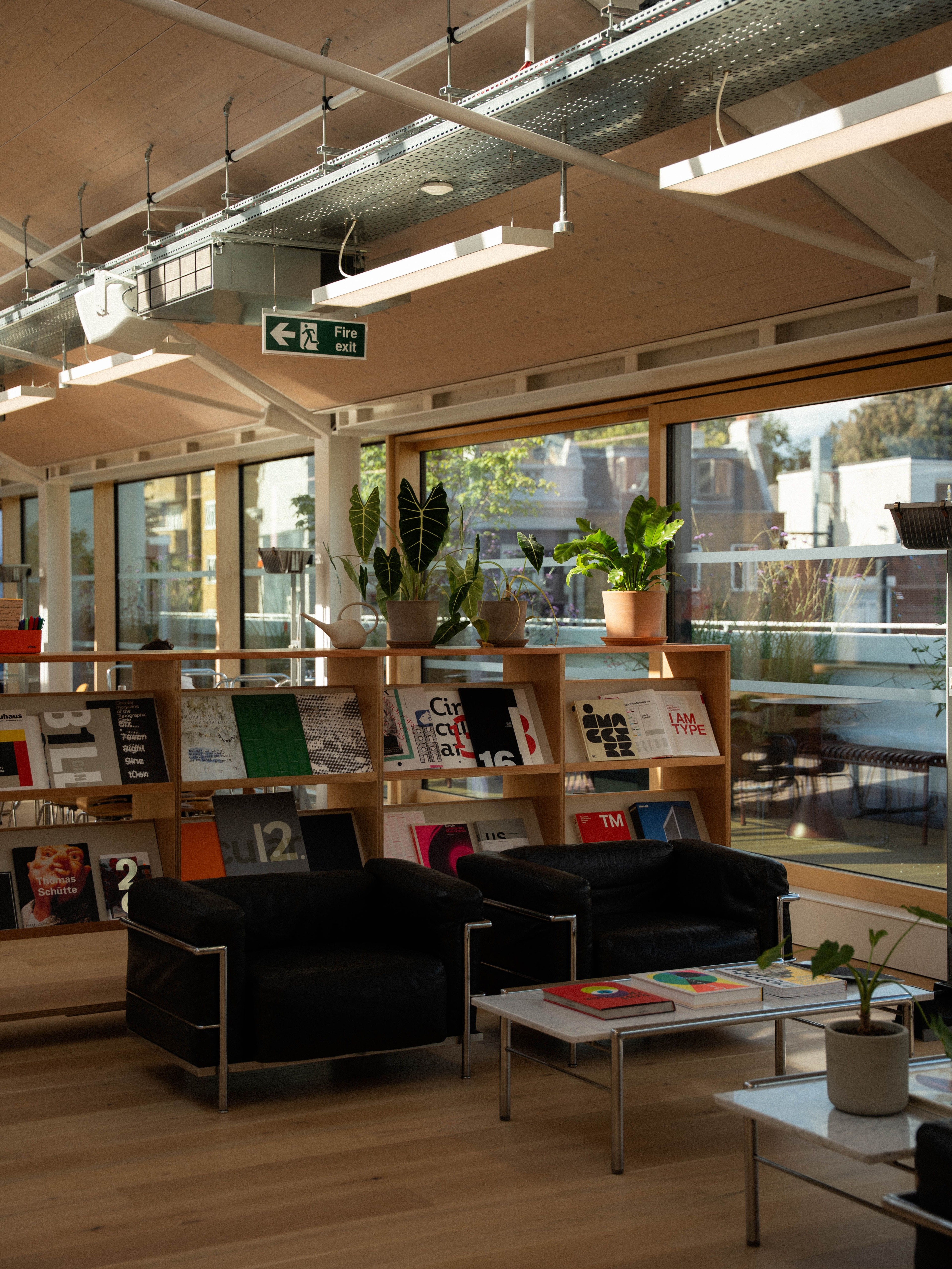
Your studio seems like a very creative environment. How does that influence your process?
“We recently moved to a new studio with a great workshop. That’s where all our experiments happen. It’s a space meant to spark creativity, somewhere people can try things, jot down ideas, and test them out.
We keep a large library of books: design, art, culture, architecture… everything that inspires us. We also publish books ourselves.
For me, it’s essential to create a space that encourages creativity, instead of a factory-like environment with people sitting behind screens. An open, inspiring studio benefits everyone.”
Where else do you find creativity?
“I find creativity everywhere. As a kid, I was always painting, making crazy constructions with kitchen objects, anything I could find. Creativity is a way of living, and you need to nurture it all the time.
Creativity is not a job, it’s a way of living.”